FLIK · 2023–25 · 6 min read
Making one-click checkout worth logging in for
FLIK's checkout is only one-click for shoppers who log in, yet most of them skipped login. Over four phases I found out why, and redesigned the way into checkout so it's faster and gives shoppers a reason to log in.
The problem
FLIK's value (saved details, cashback, one-click buying) only works when shoppers log in. Once guest checkout launched, it out-converted login by 5.15%, and later shoppers started dropping off at the login step.
My role
Product Designer, leading the research. One of two designers, working with the CEO, two PMs and engineering.
What I did
Four phases of research and redesign: a heuristic audit, an unmoderated Maze study, a session fix with engineering, and a one-step flow refined through guerrilla testing.
Outcome
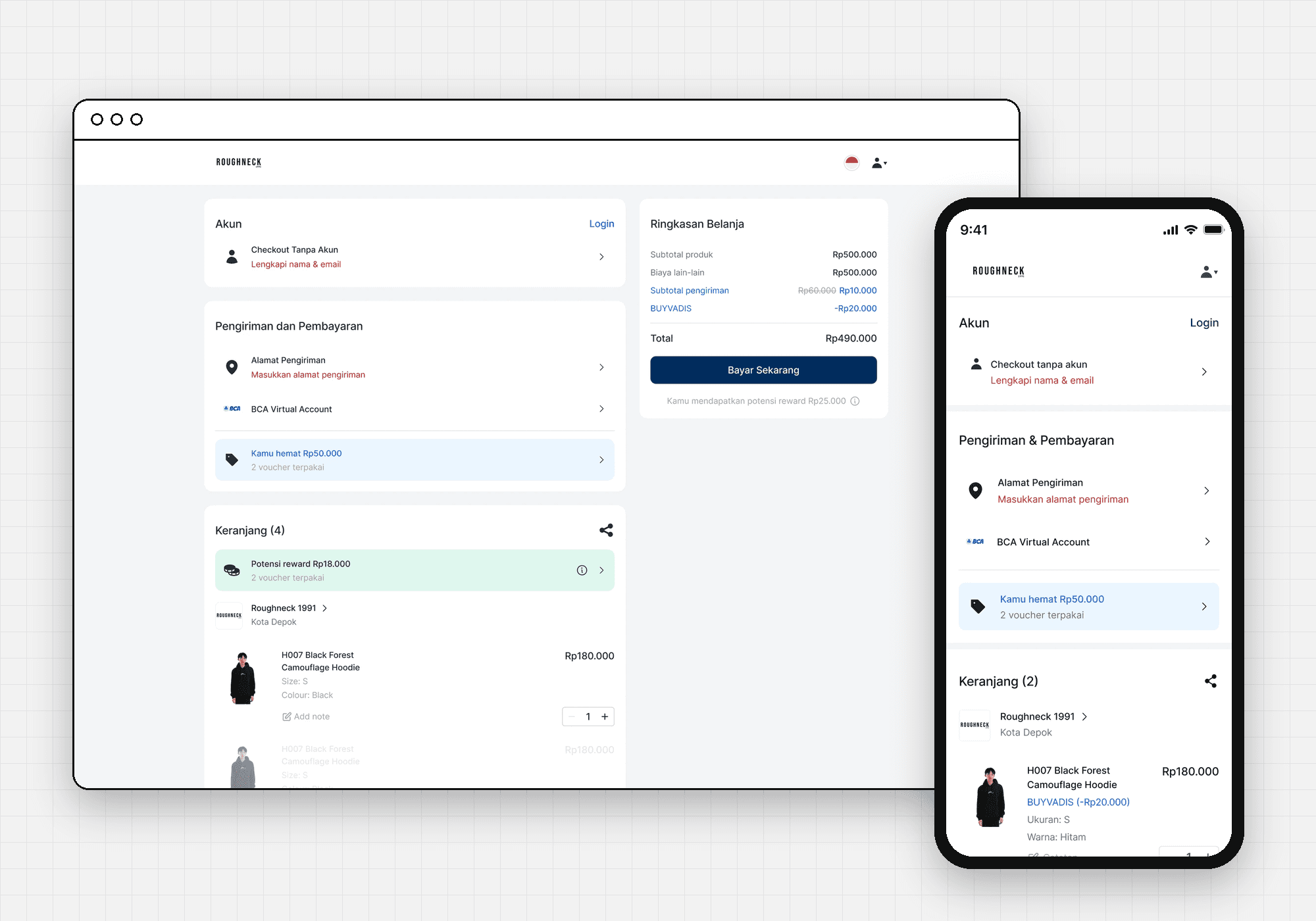
Shipped a one-step checkout that shows the shopper's potential reward right where they pay, and logins that last a month instead of 48 hours. Conversion impact isn't measured yet (see “Impact, honestly”).
The short version
The trade-off behind every phase
Brands add FLIK to their own websites as a one-click checkout. When a shopper clicks “checkout” on the merchant's site, they land on FLIK. If they're logged in, their address and payment are already filled in, on every FLIK merchant, and they earn cashback.
The easiest path for a shopper is guest checkout. The path that makes FLIK valuable is logging in. Every phase of this project was about making checkout easier without making login feel optional.
Four phases in 30 seconds
- Phase 1 · Audit and redesignNo data yet, so I started with a heuristic review of the live checkout and shipped a cleaner page.
- Phase 2 · A 5.15% gapGuest checkout beat login. Research showed shoppers wanted the rewards but chose guest because it felt faster.
- Phase 3 · A drop-off at the login stepA one-month session fix shipped right away, while a one-step flow was tested.
- Phase 4 · Balancing the two pathsThree more test rounds of a cashback-first checkout, then the version that's live today.
Phase 1 · Start with what you can see
- Trigger
- An open brief from the CEO: improve checkout. No target metric, no analytics.
- Method
- Heuristic evaluation on Android, then 4 rounds of feedback with the CEO.
- Result
- A clearer checkout, plus FLIK's first desktop version. Not measured.
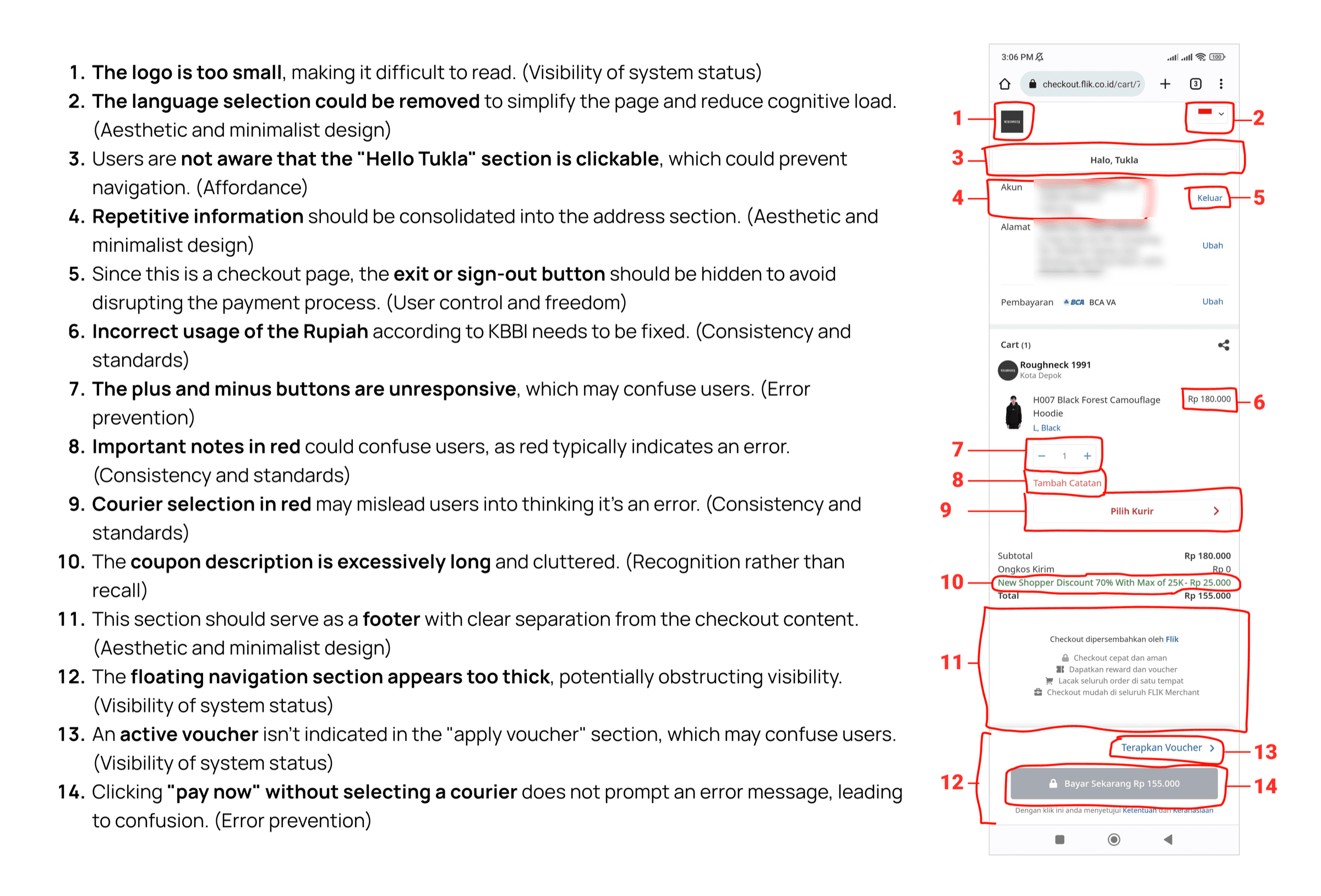
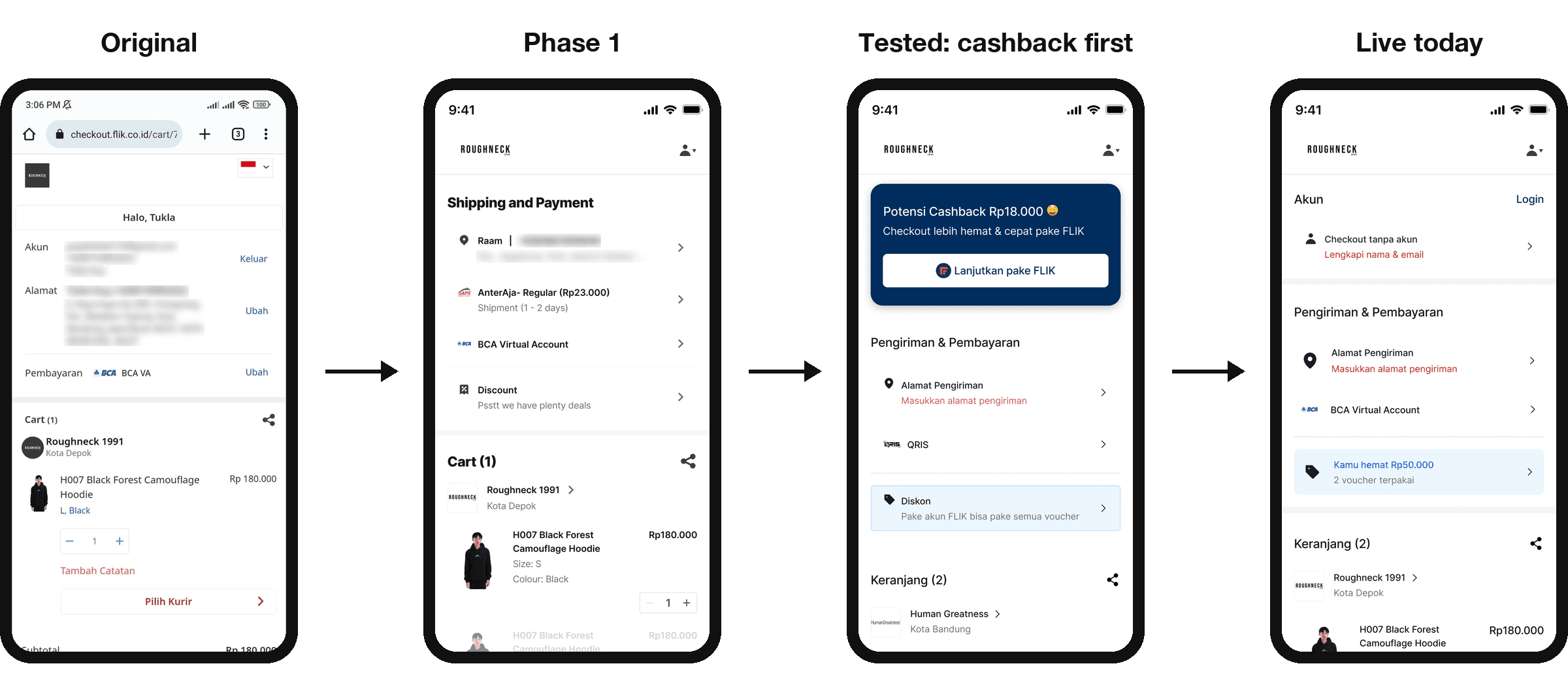
This was my first project at FLIK, and the company was a year old, so there was no data to start from. I reviewed the live checkout against standard usability heuristics and found 14 issues. Most were about clarity: a logo too small to read, repeated information, a cluttered coupon section, and a “Pay now” button that failed silently when no courier was chosen.
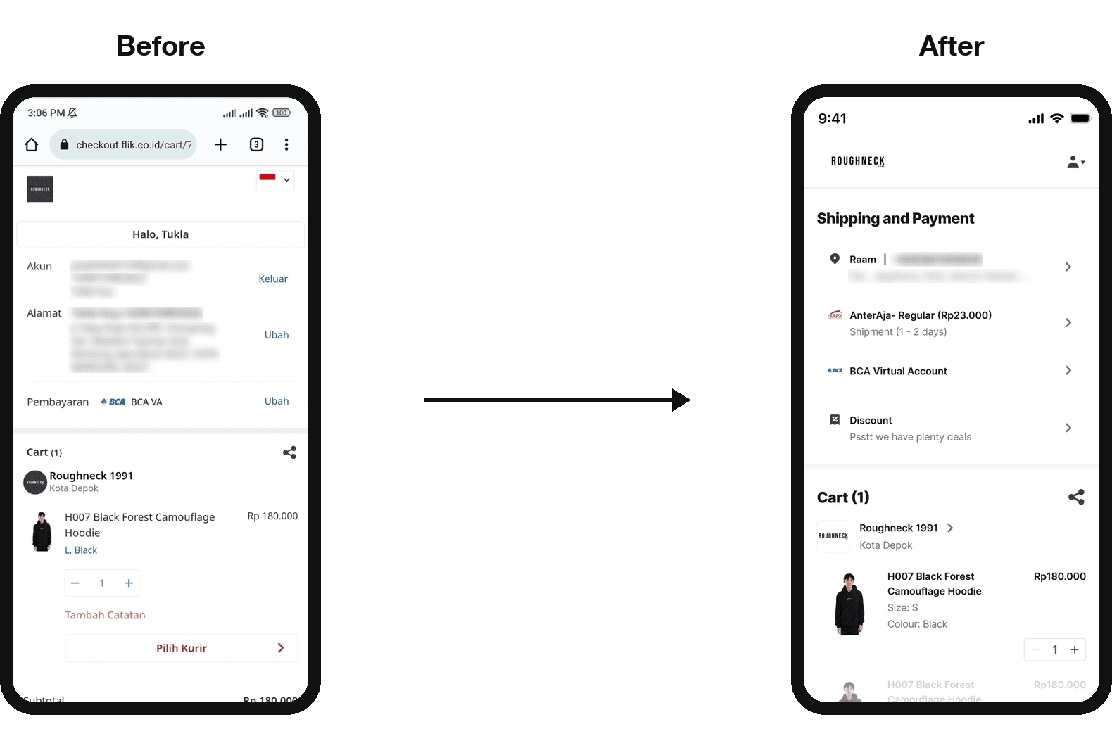
I took low-fidelity fixes through four rounds with the CEO, then moved to high fidelity. With no PM yet, I also briefed engineering and ran the handoff. The CEO then asked for a desktop version, which FLIK hadn't had.
Takeaway: without a baseline, I couldn't show whether this worked. From then on, each phase started from data or research.
Phase 2 · Shoppers wanted rewards, but chose speed
- Trigger
- Three months after guest checkout launched, it converted 5.15% better than login.
- Method
- Unmoderated study in Maze with recent guest and logged-in buyers.
- Result
- A new understanding of the problem, and a recommendation to make the reward visible.
FLIK added guest checkout to reduce friction: pay with just a name, email and phone number. Another designer led it. I'd argued it would undercut login, then committed to making it work. Three months later the data showed the risk: on the page where shoppers choose, guest checkout was winning.
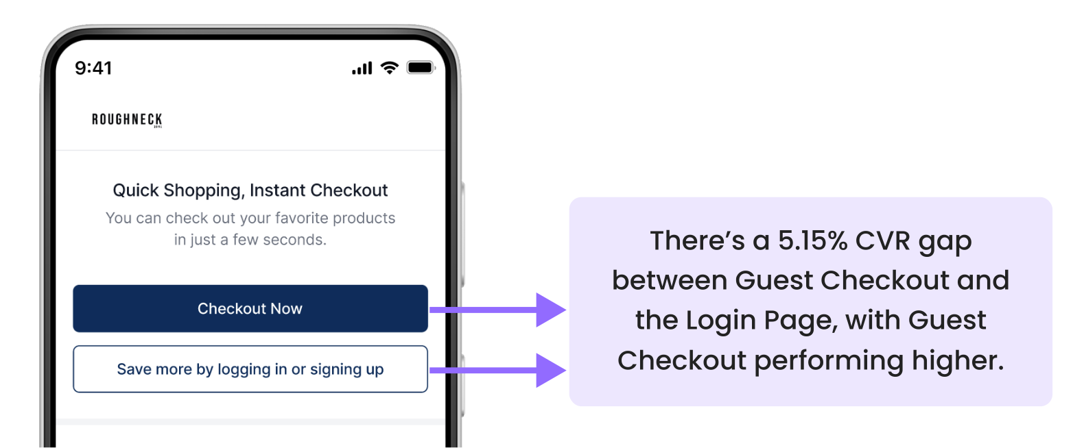
The obvious move was to rearrange the buttons. I wanted to know why people chose guest first. The study asked what shoppers cared about before showing any screen, then had them check out and explain their choice.
- 100%
- said they'd rather save with rewards
- 68%
- still chose guest checkout
- 9.1/10
- rated checkout easy
Shoppers wanted what logging in gives them, but chose guest because it felt faster, even though logged-in checkout is the faster one. The benefit of logging in was invisible.
Decision: keep the layout, because guest checkout supported the business priority at the time (transaction volume), and make the benefit of logging in obvious, with clearer copy on the login prompt and a subtle shimmer to draw the eye. Engineering had other priorities, so it waited, but this insight shaped every phase after.
Phase 3 · Fix the leak now, redesign the step next
- Trigger
- The PM spotted a significant drop-off on the log-in-or-guest page.
- Method
- Root cause with engineering, then guerrilla testing of a one-step flow (10 people, Figma prototype).
- Result
- Logins extended from 48 hours to 1 month (shipped). One-step flow validated, with a new risk.
The quick fix. Logged-in shoppers should skip that page entirely, but logins expired every 48 hours, sending returning shoppers back to it. The 48 hours existed for security on shared devices and to keep stored carts small. Engineering said cart size was manageable. As for security, being logged in never moves money on its own: QRIS and virtual-account payments are approved in the shopper's own bank or e-wallet app, and cards go through 3-D Secure. So we extended logins to one month, and it shipped.
The bigger fix. After a competitor review and a brainstorm with the PM, we proposed removing the page altogether: click checkout, land on checkout.
It was a big change, so we tested it quickly: 10 people recruited near our office tried today's flow and the prototype, on phones and laptops.
- What worked: it felt more straightforward, with fewer decisions and less commitment before seeing the order.
- What didn't: people still didn't know logging in earns cashback, and guest checkout became even more dominant.
We'd removed the friction but created a new problem: with no reason to log in shown, guest checkout would win even more often.
Phase 4 · Make logging in the obvious choice
- Trigger
- The one-step flow made guest checkout too dominant.
- Method
- Three more rounds of iteration and usability testing.
- Result
- Clicks between guest and login evened out in testing. A one-step checkout that shows the reward shipped.
The answer came from phase 2: shoppers log in when they can see what they'll get. So I tested a checkout that opens with the shopper's actual potential cashback and a single “Continue with FLIK” button, while guest checkout stays one tap away. It's one step for everyone, with a visible reason to log in.
The CEO preferred a different look for the final screen, so I rebuilt it around the same tested principles: one step for everyone, with the shopper's potential reward shown in the cart and right under the pay button. That version is live today.
Impact, honestly
- Shipped: a redesigned checkout and FLIK's first desktop version, logins that last a month instead of 48 hours, and a one-step entry that shows the shopper's potential reward where they pay.
- Changed how the team saw the problem: the gap between guest and login was about perceived value, not button placement.
- Not measured yet: FLIK doesn't currently track the checkout funnel, so I can't claim a conversion number. The first thing I'd measure is the share of logged-in checkouts before and after launch, then A/B test how the reward is shown.
From someone who was there

“I highly recommend Raam as a talented product designer. He elevated my vision beyond expectations with his creativity and user-centric mindset. A true team player, he integrates user needs seamlessly and delivers intuitive designs. Any project in his hands will exceed expectations!”
What I'd do differently
- Agree on a success metric before designing. Phase 1 shipped with nothing to measure it against; I now put a metric in every brief.
- Ask for an experiment before big launches. I disagreed with how guest checkout launched; a test with a clear success metric would have settled it with data.
- Pair small tests with funnel data. Ten guerrilla participants give direction, not proof.