Designing a ride-hailing ecosystem as the only designer
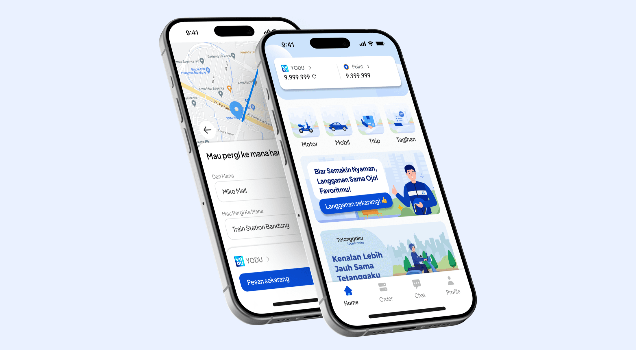
A small team set out to compete with Gojek and Grab. As the only designer for two years, I designed every screen across three apps, which together passed 100K downloads.
The problem
Launch a ride-hailing service in a market Gojek and Grab already own, with a fraction of their team and no design function.
My role
Sole UI/UX designer (freelance) for two years, working directly with the PM, CEO and CTO.
What I did
Designed every screen of the customer app and both driver apps, from requirements to developer walkthroughs.
Outcome
100K+ downloads and 4.3★ on Google Play from 2,200+ reviews.
Video · The whole project in about 70 seconds, narrated
The challenge
Tetanggaku, “my neighbour”, entered a market where riders and drivers already know Gojek and Grab inside out. The team was small, briefs were usually verbal, and there was no other designer, so the experience had to be right without the time or people to explore widely.
100K+
downloads
4.3★
Google Play, 2,200+ reviews
3
apps, one designer
Three decisions
Decision 01
Familiar patterns over novel ones
Situation
Every rider and driver in Indonesia already knows how Gojek and Grab work.
Instead of
Design a distinctive new booking flow to stand out.
Why
A new flow would force people to relearn something they do daily, for no benefit. A small team's effort was better spent making the familiar flows clear and quick.
Result
I studied both leaders' flows and adapted their proven patterns to what our team could build and maintain.
Decision 02
Straight to high fidelity, with early alignment
Situation
Requirements arrived as verbal briefs, and the business needed screens fast.
Instead of
The textbook path: wireframes, then low fidelity, then high fidelity.
Why
With one designer, each extra stage delayed delivery. Shaping requirements with the PM and aligning with the CEO and CTO up front reduced the risk of skipping stages.
Result
I designed directly in high fidelity and walked the team through each journey before it was built.
Decision 03
Design both sides of every trip together
Situation
A ride involves two people looking at two different apps at the same moment.
Instead of
Design the customer app first and treat the driver apps as an afterthought.
Why
A confused driver means a late ride, so driver experience is customer experience.
Result
Customer and driver screens were designed as one journey, so what a rider sees always matches what their driver sees.
What I designed
One trip, two apps. Blue lines are the moments where what the rider sees has to match what the driver sees.
Customer appMotorbike and car rides, item delivery (Titip), e-wallet, referral program and more.
Motorbike driver appReceiving and managing orders, e-wallet, referral program and more.
Car driver appThe same core flows, adapted for car trips.
Close to the users
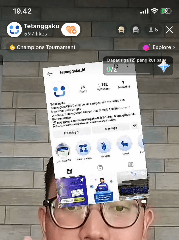
In my last few months at Tetanggaku, the team also asked me to host its TikTok Live for about three months: teaching drivers how to use the app and promoting the service.
Live on Tetanggaku's TikTok, walking drivers and riders through the app.
It turned into a regular feedback loop. Drivers asked their questions live, and where they got stuck showed me what wasn't clear yet. Some of that feedback went straight back into the design.
What I'd do differently
Build a small component library earlier. Designing three apps alone, shared components would have kept them consistent with less effort.
Write lightweight specs. Verbal briefs were fast, but a one-page summary per feature would have reduced back-and-forth during development.
From someone who was there
BHBairuni HasibuanCEO, Tetanggaku
“The team understood our complex requirements and provided a user-friendly, high-performing website that stands out in the market.”